I design sites in Webflow every day, and I enjoy it. Still, sometimes, I stumble upon interesting corner cases that Webflow can’t handle by itself yet, so I have to hand code a little. And yes, I’m a designer who codes from time to time. Working as a part of the outsource development company brings many challenging tasks :)
Recently I caught myself thinking about how many custom code snippets I use for Webflow development. I figured out that I have a lot of useful ones to share. I’ve included a few tricks in this article - more to come! Follow our blog to stay updated on Webflow tips and code snippets in the future.
Removing font ligatures
In typography, Ligature binds two or more characters into one, which sometimes looks like an issue. Some Web browsers like Safari browser on both Mac OS X and iOS show standard ligatures by default.
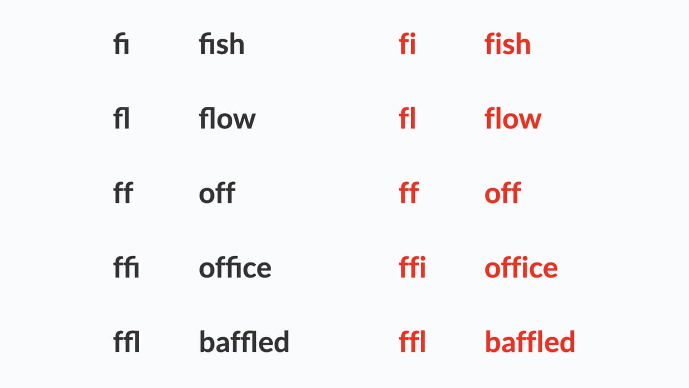
If you have expanded or collapsed tracking (CSS: Letter-spacing) in the font you use, you will see that some letters are defined as one symbol:

I bet you’ll want to disable Ligatures - use the following custom CSS code for the entire website or just for a specific selector by a class name:
/* Disable Ligature for the entire website */
* {
    font-variant-ligatures: none;
}
/* Disable Ligature for a specific selector */
.class-name {
    font-variant-ligatures: none;
}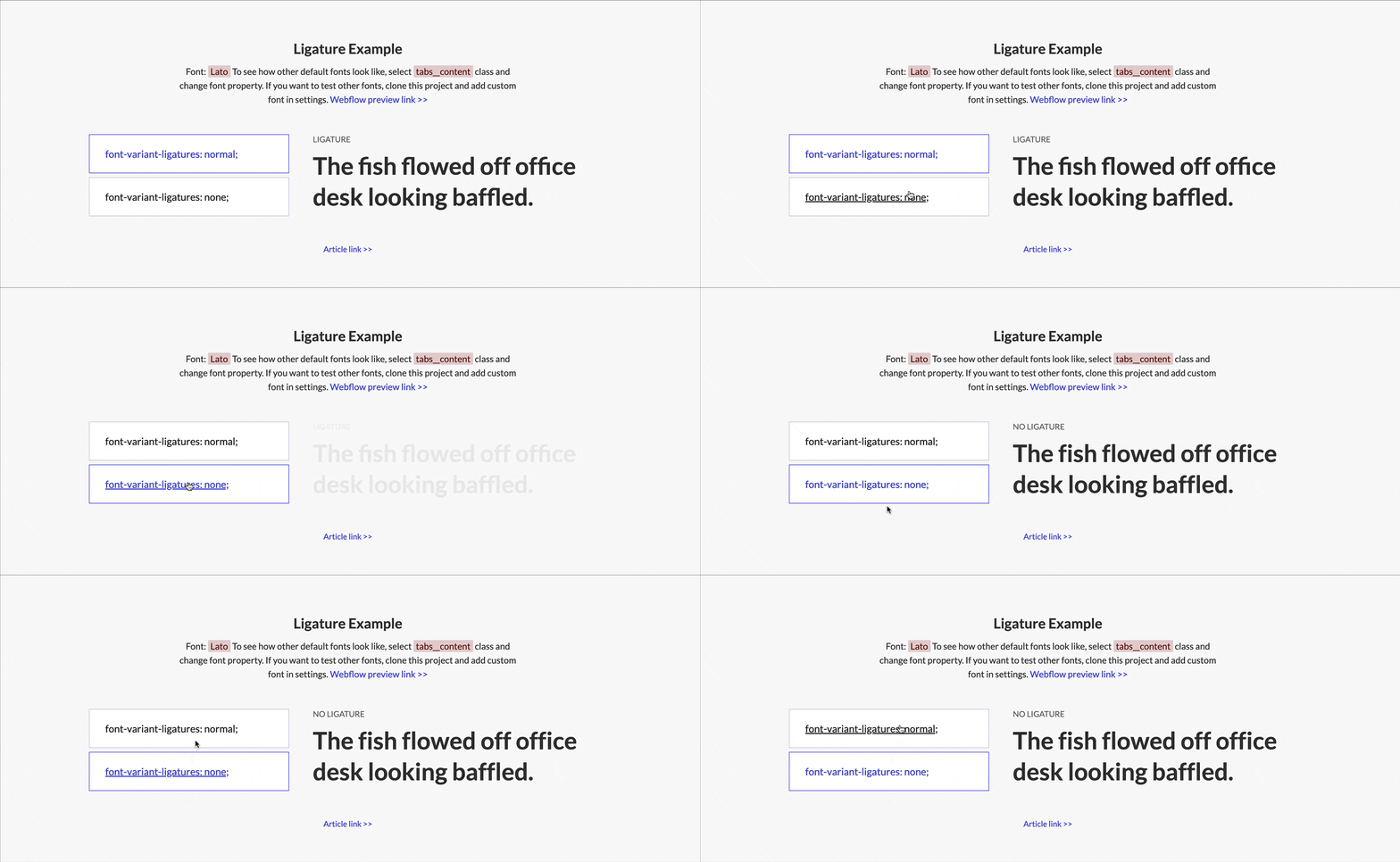
Learn more about ligatures issues described by Jason Tselentis, Associate Professor at Winthrop University’s Department of Design.
Preventing scaling on mobile
Some browsers on mobile, especially Apple ones, tend to autoscale the viewport. Autoscale happens when you click on the Input or the Text area if your inputs have font-size less than 16px. It’s painful for users to fill in such form as it scales while you type and doesn’t scale back after a user stops typing.
To make all text elements on a page readable and legible without zooming, disable scaling by using this itty-bitty code snippet:
<meta name="viewport" content="width=device-width, initial-scale=1.0, maximum-scale=1.0, user-scalable=no" />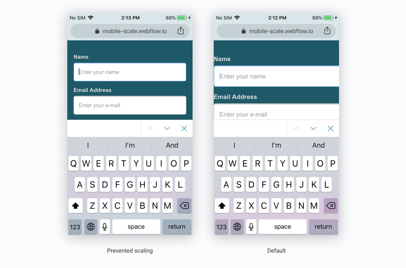
Want to go deeper and prevent scale effect only on input click? Check article on dynamo6 as well.
Improving height behavior: 100VH on mobile
Another pretty known issue is an ugly jumpy effect when you use 100VH points on mobile devices. As mobile browsers have a top address bar as a part of the UI, some space of your section will be cut or layout will be re-rendered and re-adjust since the dimensions have changed. Which is bad for user experience.
This issue was mentioned so many times in different articles and forums, but I would like to mentionone where I take the solution from. Here’s the magic you’ll create:
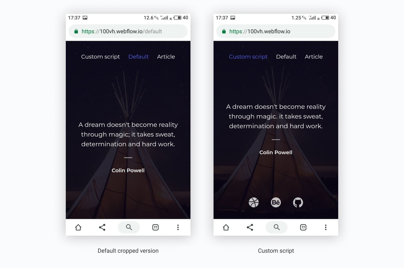
As you can see, social icons get cropped at the bottom, but we want to see them without scrolling. Check out how it looks on mobile.
Just use a small chunk of JS and CSS to fix this - put the code into the heading of a page using Script and Style tags respectively.
JavaScript:
// First we get the viewport height and multiply it by 1% to get a value for a vh unit
let vh = window.innerHeight * 0.01;
// Then we set the value in the --vh custom property to the root of the document
document.documentElement.style.setProperty('--vh', `${vh}px`);
When you scroll down, the address bar is collapsing which updates the value of --vh and repaints the page so
the user may experience a jump effect.In case of fixed height for the mobile landscape breakpoint, we don’t need the event listener as you can find in the original example:
// We listen to the resize event
window.addEventListener('resize', () => {
 // We execute the same script as before
 let vh = window.innerHeight * 0.01;
 document.documentElement.style.setProperty('--vh', `${vh}px`);
});
CSS:
@media (max-width: 991px) {
    .hero {
        height: calc(var(--vh, 1vh) * 100);
    }
}
/*We set the fixed height for mobile landscape because there is not enough height space for the one screen section*/
@media (max-width: 767px) {
    .hero {
        height: auto;
        min-height: 500px;
    }
}
/*And then again calculate the height for the hero section*/
@media (max-width: 479px) {
    .hero {
        height: calc(var(--vh, 1vh) * 100);
    }
}
On a side note, updating the value of --vh will trigger a repaint of the page, and the user may experience a
jump as a result. Because of this, I'm not advising you to use this trick for every projector to replace all
usage of the vh unit, but only when you need your users to have an exact viewport unit value.Resetting Apple default form styles
It’s a common practice to keep all inputs, text-areas, and selects under control and make them consistent across all devices, so I use custom form style. To reset iOS default styles for the entire website, add the following CSS code at the end of the <head> tag in project settings:
/*Reset apple form styles*/
input, textarea, select {
    -webkit-appearance: none;
    -moz-appearance: none;
    appearance: none; border-radius: 0;
    background-image: none;
}
Using Open Graph Image
Webflow has its own Open Graph Image URL field for each page.
To add Open Graph Image, you need to:
Create an image with recommended dimensions - at least 1200px by 630px and with 1.91:1 aspect ratio.
Upload it to Webflow.
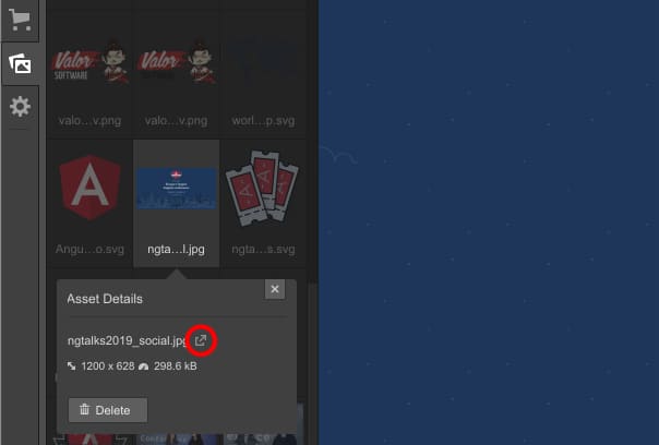
Open it in a new tab as shown on the image above.
Copy its URL from a browser’s address bar.
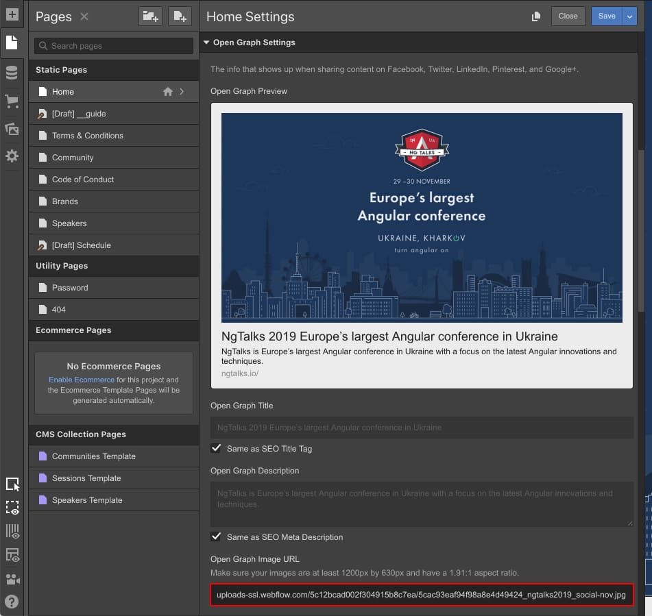
Paste the link to the Open Graph Image URL field for the required page as shown on the image.
If you need to insert the same image throughout the site, add meta tag with a link to your open graph image to the Head section in Webflow project settings instead:
<meta property="og:image" content="https://assets.website-files.com/your-link.jpg">Preventing scroll when a pop-up is opened
By default, when you open a pop-up or menu and start scrolling, the main content will scroll too. You can’t fix that with native Webflow features, but it’s not a big deal to add a short script to prevent this:
// Prevent scrolling on click
$('.menu-btn').click(function (e) {
    e.preventDefault();
    $('body').css('overflow', 'hidden');
});
/* Allow back page scrolling by clicking on the element with the necessary class name. If you have several close elements with the same action like a close button and cancel button, write classes by a comma.*/
$('.close-menu-btn, .menu-wrap').click(function (e) {
    e.preventDefault();
    $('body').css('overflow', 'auto');
});
See how this script works - all interactions except the script were made with Webflow built-in interactions 1.0.
Closing modal window on the ESC button
It’s time to improve the accessibility of modal dialogs too! Add an event listener that waits when the ESCbutton is pressed and then runs the same action as the .modal__closeclass:
// close CTA section on the ESC button
document.body.addEventListener('keydown', function (e) {
 if (e.key === 'Escape') {
  document.querySelector('.modal__close').click();
 }
});
Btw, note that .keypress() doesn’t work on MacBook Pro with touch bar, so use .keydown() instead.
Customizing text selection color
Quite often you need to change text selection color to fit brand colors or just make a text selection eligible for seeing what you select. Use this script to customize that:
/*Text Selection Color*/
::selection {
 background: #173686; /* WebKit/Blink Browsers */
}
::-moz-selection {
 background: #173686; /* Gecko Browsers */
}
That’s it for the first episode. Follow us on the Web or subscribe to get more code snippets and tricks! Feel free to share custom scripts you use in the comment section below, or let us know if you are having any issues with Webflow and we will do our best to help you!
See you in the next episode!

