The presentation is one of the most popular means of visually conveying information to an audience. Presentations are used everywhere by various specialists in various fields, because of the ease of their compilation and the popularity of the content form. Due to such popularity, people in the corporate segment developed a set of approaches, norms, and rules for presentations. Because all corporate presentations should be designed in the same style to represent the company’s brand in the best way possible, it is better to use unique templates for this purpose.
The creation of such templates assumes thoughtful work on the structure, hierarchy of components, colors and fonts, universality in use and correctness in the design of visual information, therefore such templates should be created properly. The difficulty in creating a template pays off the ease of its use by other colleagues who does not possess appropriate design knowledge. So our design team set the goal of creating a template for presentations that will be comfortable and versatile to use and not imply special knowledge and skills, will be flexible and convenient to use.
Research and a proper tool selection
As the employees of our company work in various operating systems and to increase flexibility, we considered only web-based solutions.
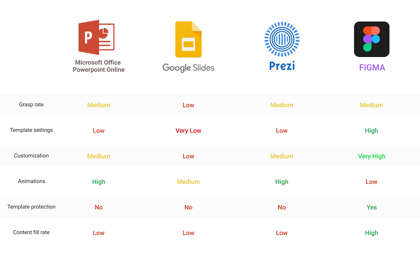
A detailed study of popular presentation tools revealed that their functionality is not enough to allow us to create all types of slides that we need for our tasks. The main complaints we had were: the impossibility of adjustable settings for image placeholders and backgrounds, limited headers hierarchy, and confined master slide customization. Faced with such a problem, we decided to seek other tools for working with presentations and found the solution unexpectedly. We decided to use one of the leading modern designer’s tools - Figma.
Presentation development. Libraries
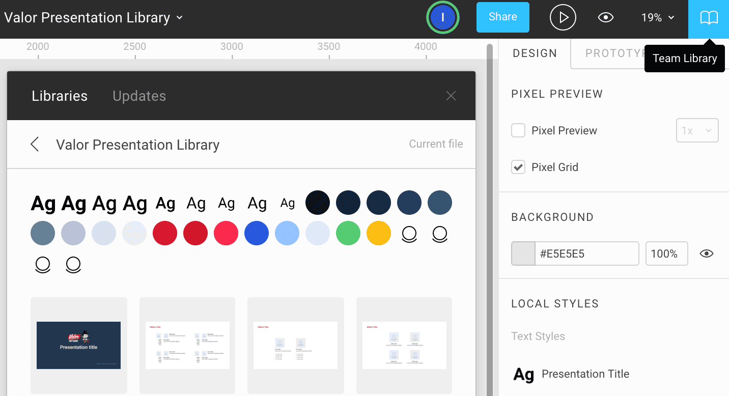
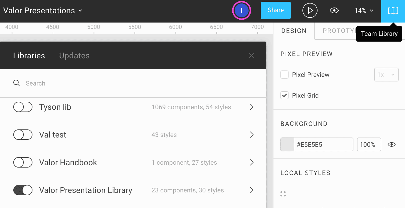
The idea was to create such a template that would require minimal skills and knowledge to work with it and allow a user to fill in the template with content quickly. Also, let’s not forget that it is necessary to protect the template from accidental changes. In addition to the built-in version control, Figma allows using libraries with predefined templates and styles, which gives an ability to work within one file without affecting the library.
Presentation development. Customization
After connecting the library to the file with presentations, we can start creating a presentation using predefined color palettes, text styles, and slides components. Each slide component has its layout for different purposes.
Here is a 9-step guide for a quick start:
#1 Create a new page and name it. We decided to go with a "one file with all the presentations and split it by pages" approach.

#2 To place a slide template inside, we need to create a frame (F), as the presentation’s preview mode requires frames for each slide.

#3 Choose (Alt+2) a slide with the desired layout in the Components tab.
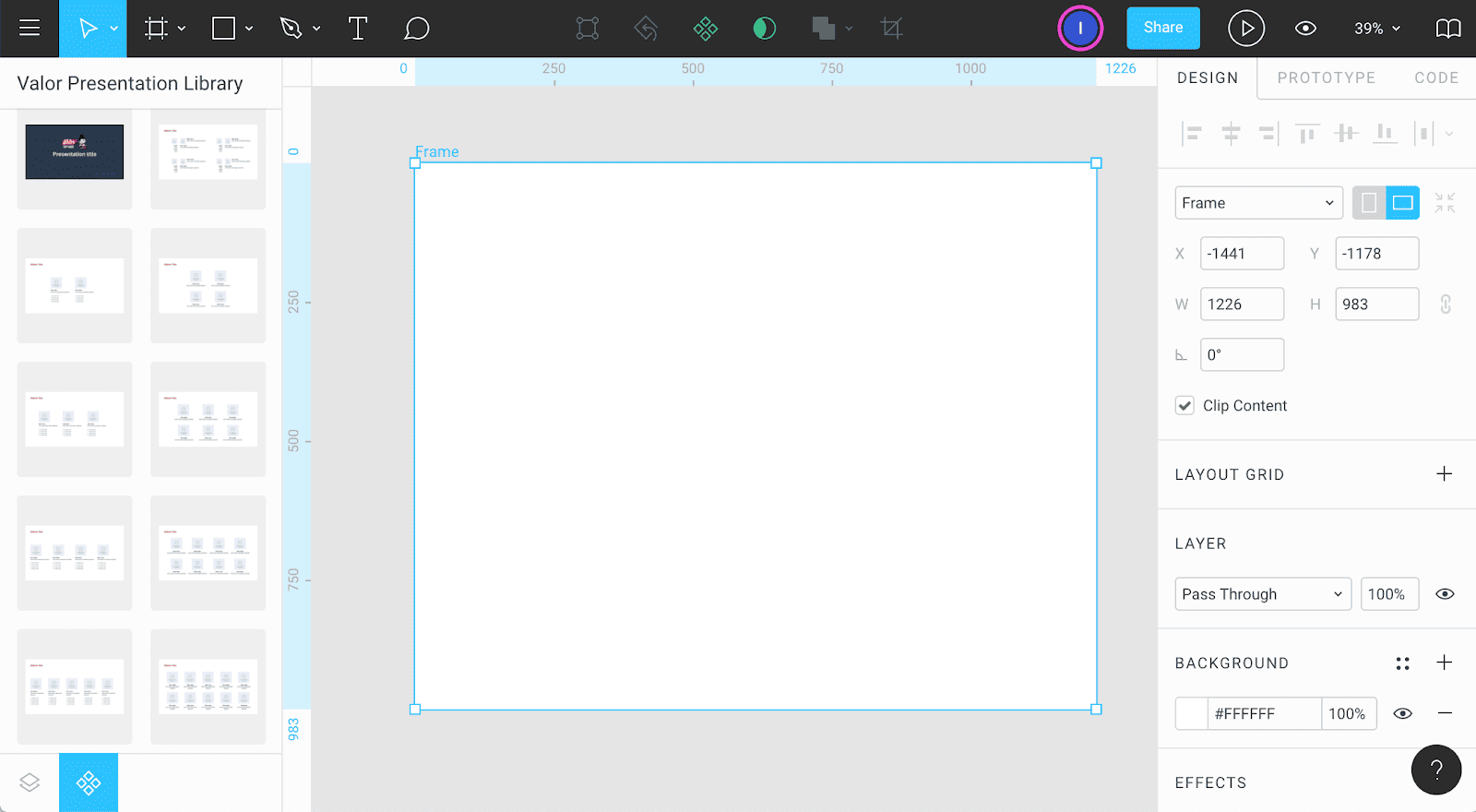
#4 Make a slide - drag and drop template slide component into the frame.
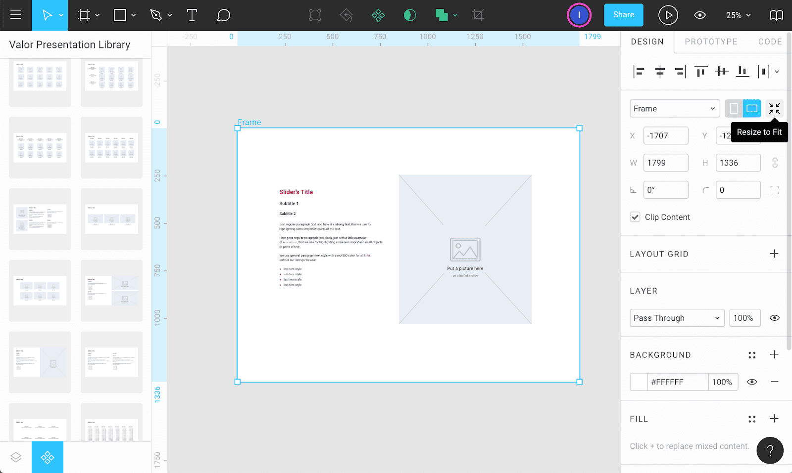
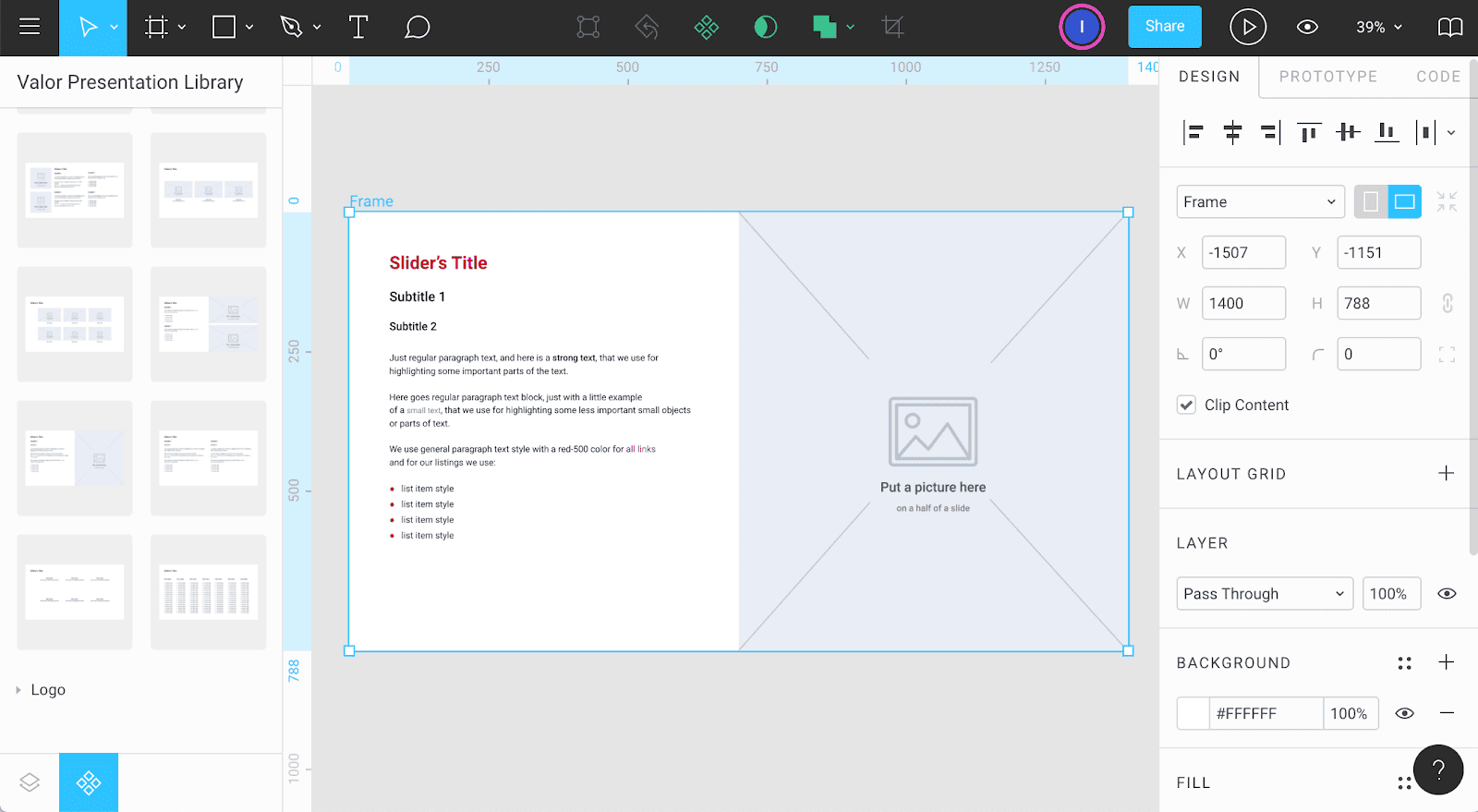
#5 Select the "Resize to fit" button in the right side of the control panel to equal slide and frame dimensions.
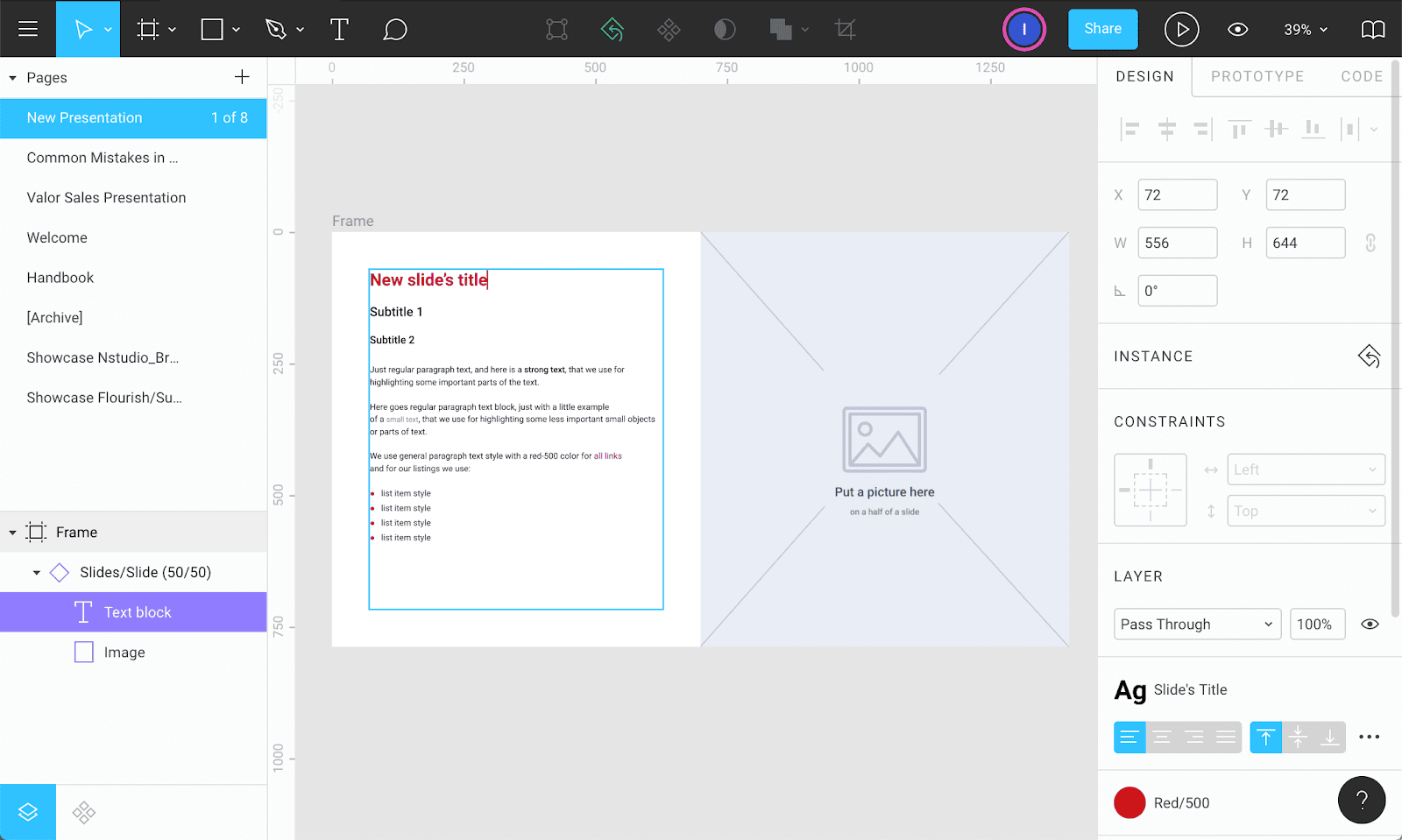
#6 Open Layers tab (Alt+1) to edit text on a slide. It’s important to remember that any work with the text has to be done only in frames of the text field.
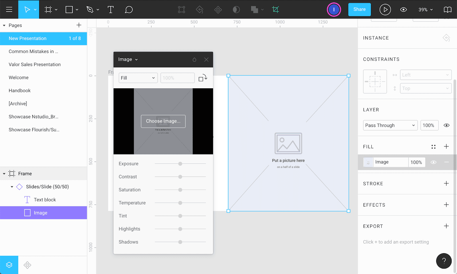
#7 Change the placeholder - select the image frame, click on the image field in the right control panel, and pick a desired one.
#8 In Figma, there is a possibility to set links only for block elements. So, if pasting a link is required, choose the Rectangle tool ® and wrap the necessary element. After that, switch to Prototype tab, pick the following settings: Trigger: On click and Action: Open URL, and paste the link.
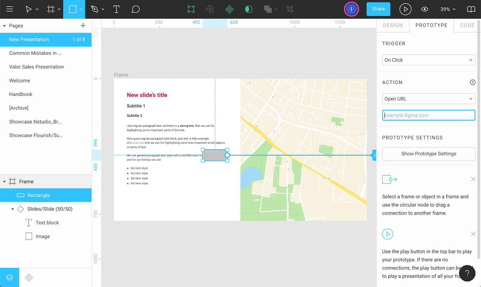
#9 Open the Design tab again and press eye icon near the fill settings to hide the grey rectangle.
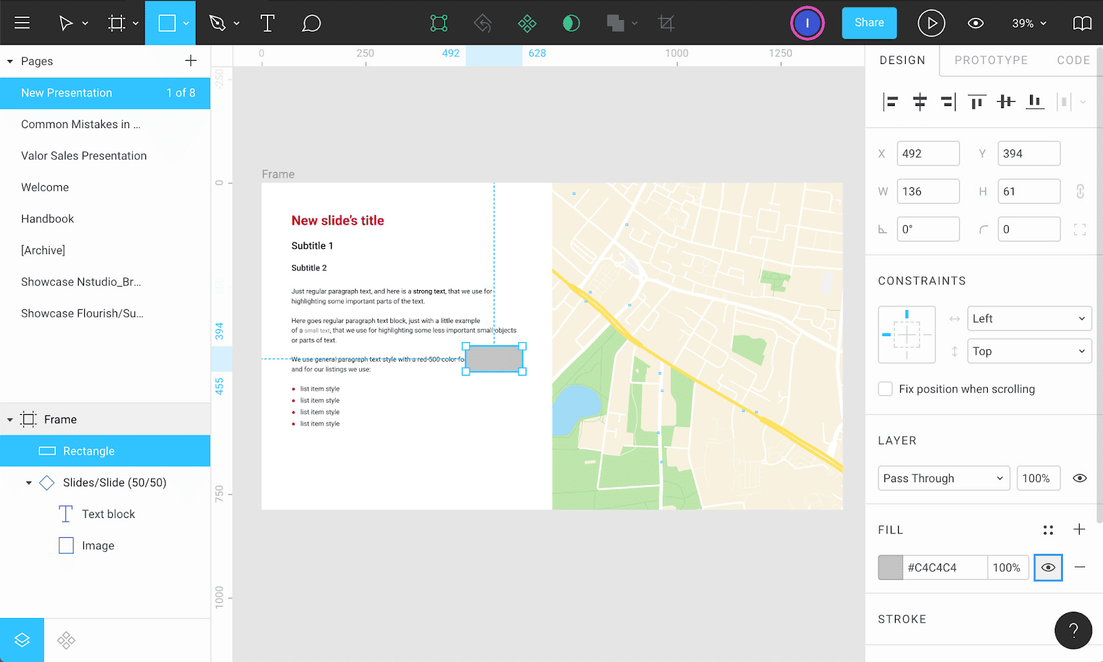
This is everything you need to start working with presentations! As you can see, this template allows to fill the slides with content quickly and does not require any special knowledge everything is available for everyone in a single browser tab.
Conclusion
Figma is a more practical tool for working with visual information, and has the following benefits:
Extensive template customization
Using the template does not require special skills
Quick and easy content filling
Parallel work on the document online
Backup and auto-save system
Prevention of accidental changes.
These are the reasons why working with presentations in Figma was a blast for us, and was happily accepted and used by various kinds of specialists across all company, allowing us to obtain well-read, nice-organized, and solid-designed presentations.
Happy designing everyone!

