In this second part of my Designing Aggregator App for Movie Tickets Purchase article, I’ll be talking about Design Interaction and Interface UI Design. Also, I’ll share my conclusions of all processes in general. Check the first part if you missed it before you go on reading this one :-)
Stage 2: Design Interaction
Technical requirements and limitations:
Based on the results of the target audience research that I had gained earlier, I generated the technical and limitation requirements that will help us in the future development:
The service is designed for Android and iOS mobile platforms.
The app offers two language options: Ukrainian and English.
Authorizing is possible through Apple account and Google account.
The system is a network of movies that has addresses and the ability to display movie places on the map and build a route to them.
In addition to ticket purchases, the app offers a pre-purchase of popcorn and drinks with a bank card or in-app bonuses, and it is possible to skip this step.
Users can find information on movie titles, actors, and directors.
The app allows filtering films by genre, technology (2D-3D-4D), age of the audience, whether it’s released or coming soon, language, and movie location.
Users can use wish lists to add and remove films.
The system suggests voting for or against the film, then it generates suggestions for the user based on his or her preferences.
The app provides notifications and the ability to turn them off if needed.
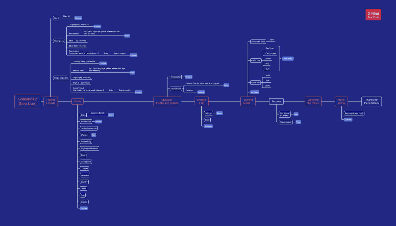
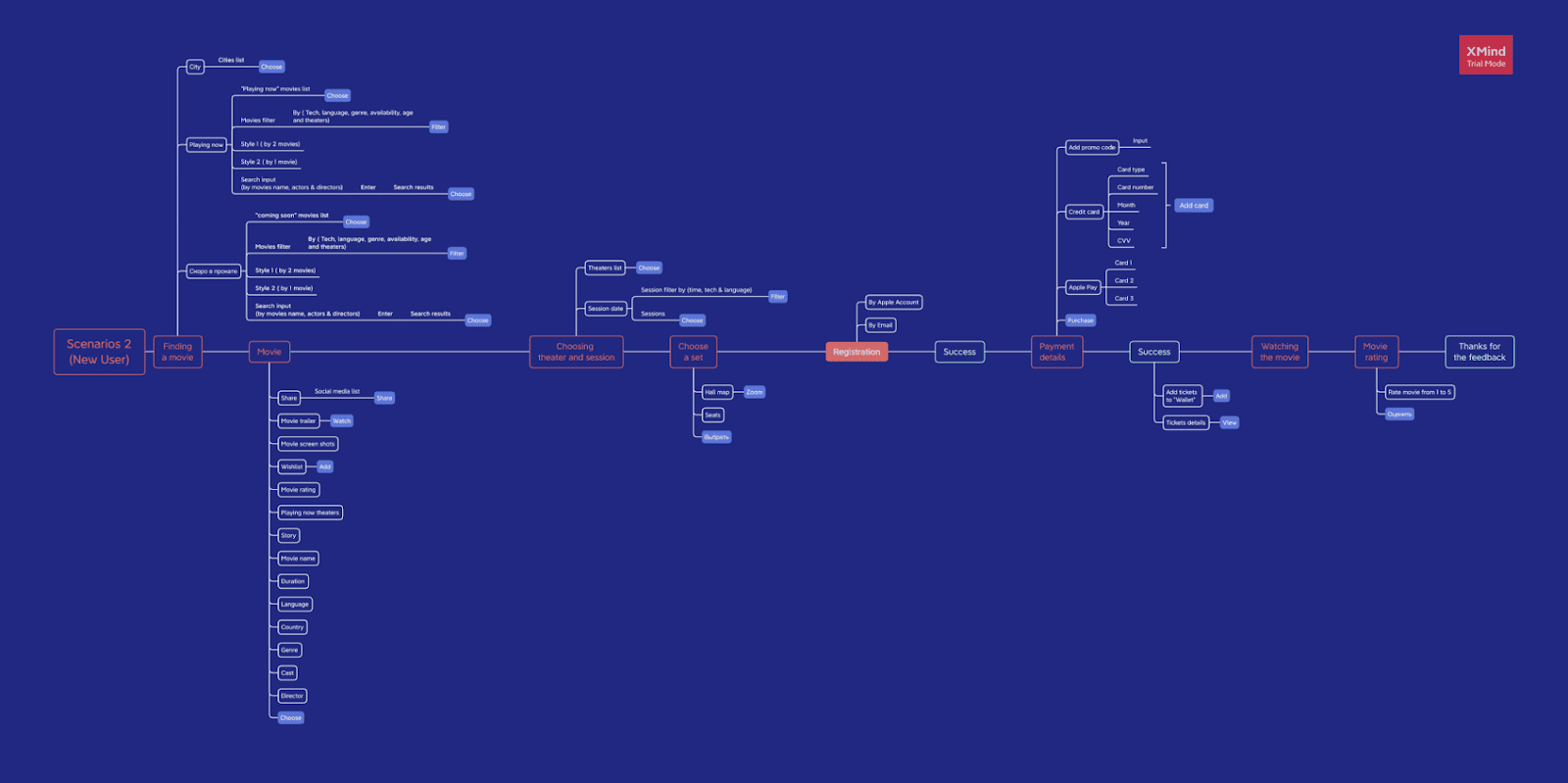
User journeys, structure, functionality, content
At this stage, I wrote out all the possible micro-scenarios, described the functionality and content for each screen, and formed the structure of the future product. This gave me a complete picture of the project. In addition, I wrote all of this out and worked on the structure. I focused on presenting information and considered the convenience of interaction, I didn’t need to think about what should be on each screen anymore.
Sketches
At this stage the process of imagination and ideas generation of the  future interface begins.
Design Interface (Wireframes)
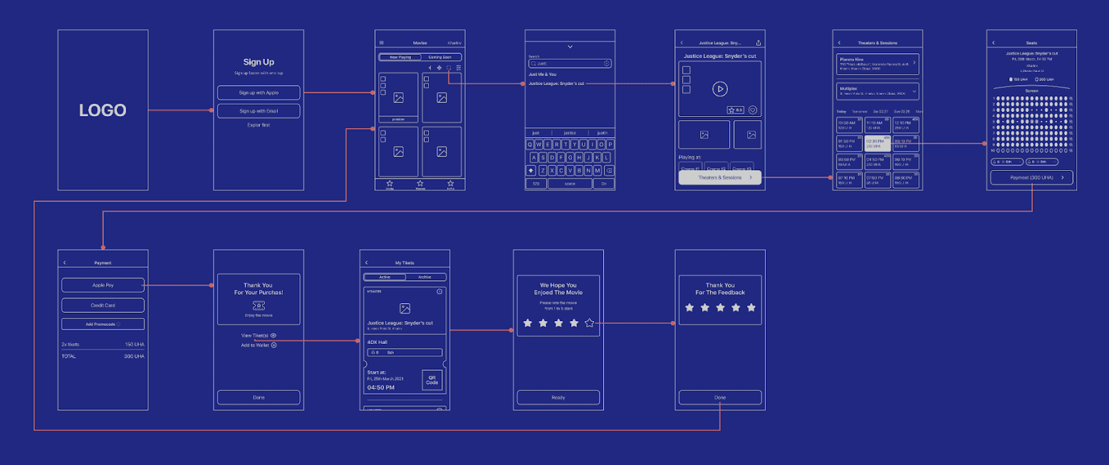
After having a basic and rough understanding of the number of application screens, we can start prototyping. I used Figma to create the Wireframes and also the clickable prototype.
During the creation of the Wireframes, I used the IOS Human Interface Design library and guidelines to speed up the process and make it possible to use it in the UI part.
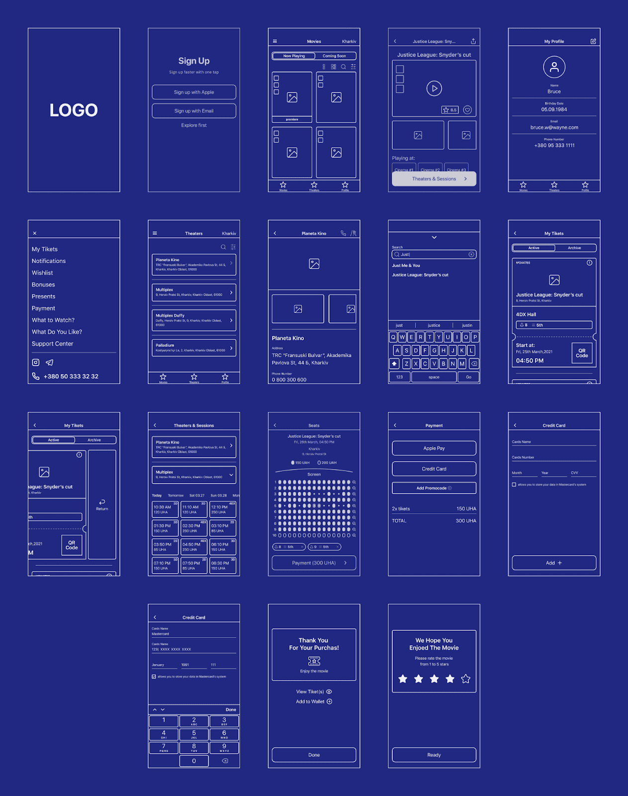
Navigation map
At this stage, usually I create a navigation map, which includes all screens of the application with the error states, after that I pass on to the developers for further product development.
In this situation, I chose one of the main scenarios and created a navigation map for it.
Stage 3: Interface UI Design
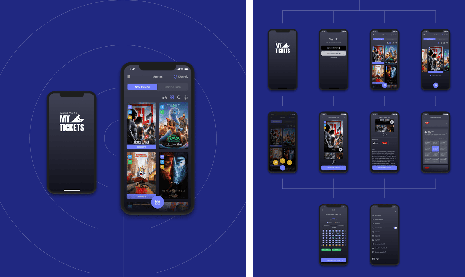
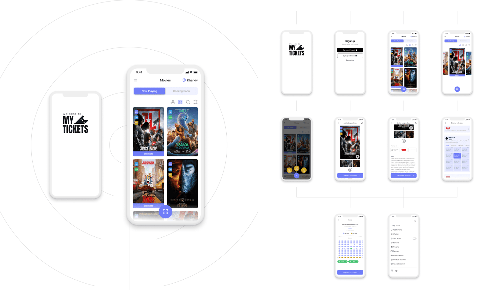
Now we begin to bring the beauty to life , create a palette of colors and UI elements of the application interface.
Dark mode
Light mode
MyTicketsApp
Sharing with you the extended designs of the app on my Behance: MyTicketsApp.
My conclusions
Being a UX designer isn’t just about creating beautiful visualization and effects, it’s more than that. Sure, the final result should be visually attractive, but what’s more important is the usability of the product.
After finishing the UX course I’m certain that creating any product based on users' feedback is the only way to go. Interacting with real users, understanding their problems and needs is an experience of a lifetime.
Always remember you are creating for people. It is the path to a successful product since people are the soul of any solution in the market.
Tools applied
I used Xmind to create the mind mapping and the functional structure, it’s a very handy App for UX designers, it’s simple and easy to use.
I used Figma to create the user flow (scenarios), wireframes and of course the interface UI. It’s one of the greatest prototyping tools which is primarily web-based, with additional offline features enabled by desktop applications for macOS and Windows.

